

March 16, 2026·Money
The Systemic Hemorrhage
Eric Pachman·article
The Systemic Hemorrhage: Mapping the Viral Spread of Labor Force Decline
In 2010, structural labor force decline was an isolated ailment. By 2025, a "geographic virus" has left 32% of U.S. counties with a labor force in structural decline, even as national totals remain afloat.
Blinded by the unemployment rate
When we think about the health of the labor market, we have been conditioned to think about the unemployment rate. It’s not our fault. The Federal Reserve’s dual mandate expressly states that it is focused on promoting maximum employment and stable prices. The number the public tends to focus on to gauge employment happens to be the unemployment rate.
However, anyone who has ever run or managed a business knows that you’ll rarely have a single key performance indicator (KPI) to measure the success of a project or business. Understanding the employment situation in the U.S. is no different. It requires many different measures to assess. Like any KPI on a broader dashboard, the unemployment rate is not “the one ring to rule them all.”
In fact, our overreliance on the unemployment rate could be misleading. And, rather than arguing that, let me show you.
Take a look at Marion, Alabama, a small town of less than 3,000 people situated in Perry County.
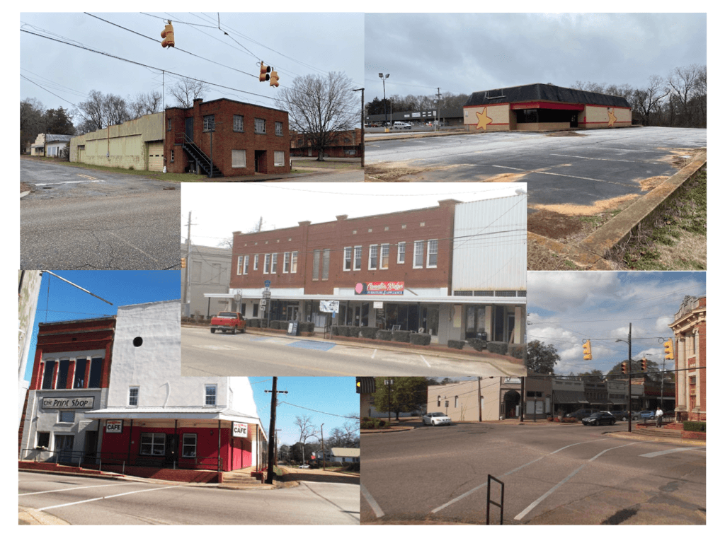
Source: Bill Mackey Real Estate
As of December 2025, Perry County’s unemployment rate was 5.1%, which is higher than the national number, but not by much. File this in the back of your mind - this is what a town with a 5.1% unemployment rate looks like.
There’s another county in America called Clark County, Nevada. You may have heard of this county, as it is the home of Las Vegas. As of December 2025, Clark County, Nevada’s unemployment rate was 5.2%, higher than Perry County’s rate. And yet, here is what Las Vegas looks like:

Source: Trip Advisor
So where would you rather live? Which city do you suspect has better job prospects? A better standard of living? A better outlook? That’s right - the one with the higher unemployment rate.
What’s in a number? What’s in 0.1% of a number? A lot, clearly.
So, unemployment rate is not the end all be all when it comes to employment measures. In fact, it’s actually far inferior to other measures given that its denominator excludes people not in the workforce. You can see how this could give us a false positive, especially as communities age and more seniors drop out of the workforce and working age people migrate to other areas with better job prospects. Counties can put up low unemployment numbers, but actually have declining working age populations (and labor forces) which puts immense pressure on their financial viability.
That’s why my latest interactive data visualization on Data 4 the People focuses on the history of the labor force in each county. When we look at the labor force data, we can see that Perry County, Alabama and Clark County, Nevada couldn't be more different.
Since January 1990, Perry County’s labor force has declined by -51%.
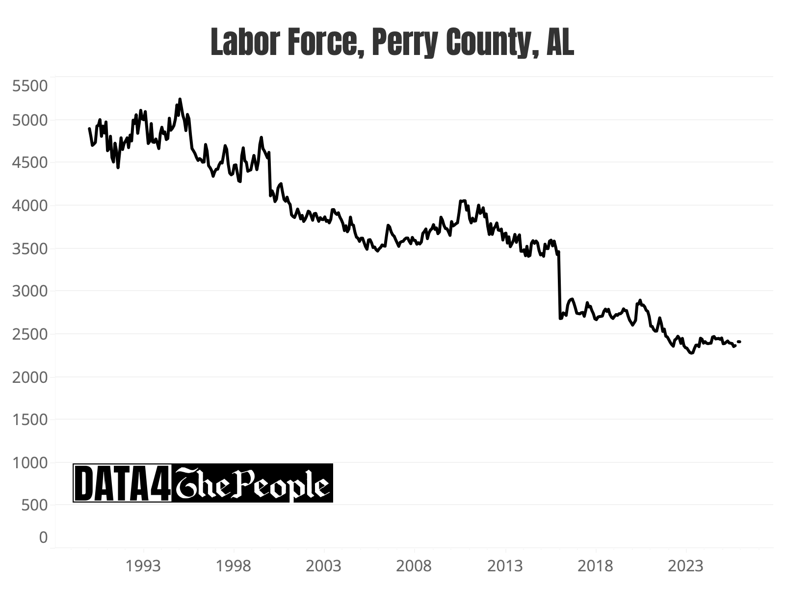
Source: Data 4 The People analysis of data from bls.gov
Over the same 35 years, Clark County’s labor force has ballooned by 215%.

Source: Data 4 The People analysis of data from bls.gov
Ahh. Now the pictures make sense, right?
The importance of the labor force trend
You may be wondering why we focus so heavily on the unemployment rate after reading the last section. My take is that it has its merits when looking at the U.S. as a whole. But clearly, it can be wildly misleading when we drill down to the county level.
Here’s an analogy. A chainsaw is a useful tool for chopping down trees. Does that mean it is the ONLY tool we need anytime we need to cut anything? Clearly not. If you want to cut a steak or perform a surgery, a chainsaw will make quite a mess. Tools with more precision are required for those activities. Yet, we use just one main tool (sidebar: two if you include nonfarm payrolls, which is rarely even statistically meaningful) and somehow this logic doesn't apply to how we assess employment.
So, let’s add a third tool to our employment analysis toolkit - the labor force trend.
It doesn't take much research to find economists who point to labor force and working age population data as absolutely critical to understanding the health of a local economy. I’ve pulled from four white papers below to showcase how they make the case. You’ll note that the institutions behind them are not fringe voices, either.
Declining working-age population will constrain revenue and test adaptability
Moody’s Investor Services
Declines in working-age population will speed up in most parts of the country over the next decade, a trend that will constrain revenue growth for US cities and counties and test their ability to adapt. The declines are not new, but they are forecast to accelerate over the next decade due to declining birthrates and rising mortality rates associated with aging populations.
The implications of a declining labor force
Center for global development
This paper explores the potential implications of a declining absolute labor force on economic outcomes… We find effects may include lower economic growth, declining government revenues, flat or declining labor force participation, and lower investment returns.
Lower labor force participation rates and slower population growth pose challenges for employers
Federal Reserve Bank of Kansas City
As populations continue to grow older in most states, several states and localities have started to experience outright population declines as individuals move away and birth rates slow. To expand their labor forces, these regions with aging and declining populations will need to increase participation rates among current residents and seek to attract new residents through domestic or international migration.
How shifting demographics are reshaping state finances
Pew Charitable Trust
A shrinking or slow-growing population can be both a cause and an effect of weakened economic prospects. Less economic activity can limit state revenue collections. And although a smaller population can lead to a reduction in some spending, it also means fewer residents are available to help cover the costs of long-standing commitments, such as debt and state employee retirement benefits.
The change in the labor force over time is like economic gravity. When it rises, a local economy can grow. When it declines, economic problems compound. Over time, if the labor force declines enough, police stations, fire departments, schools, and local infrastructure will struggle to make ends meet. Eventually the services we take for granted come to an end, and the town will dissolve its municipal charter.
Visualizing the viral spread of labor force decline
Data 4 The People’s latest visualization is the “Twenty-year Change in Labor Force by County.” For a tutorial on how to use this visualization, flip over to our instructional video on our YouTube channel. Or if you are old school and prefer to read methodology sections, here’s that for you.
First off, there is so much information and educational material in this visualization that we had to put some boundaries around what this post can realistically accomplish. We plan to write multiple posts in the near future, each which will drill down into specific geographic areas to better understand the contrasting experiences of America over the past few decades depending on where you live.
But that is not the purpose of this post. Rather, in this post, we will focus on our five key takeaways from this visualization.
- The structural decline in county labor forces is spreading like a virus across America
- There is an extreme divergence between rural and metropolitan counties
- Growth hubs are experiencing a “saturation and siphoning” effect which is lifting labor forces in neighboring counties
- There are several fascinating “hyper growth” outliers, and each has a different story
- Labor force data tells the story of the U.S. oil renaissance
Takeaway #1: Structural decline in county labor forces is spreading like a virus across America
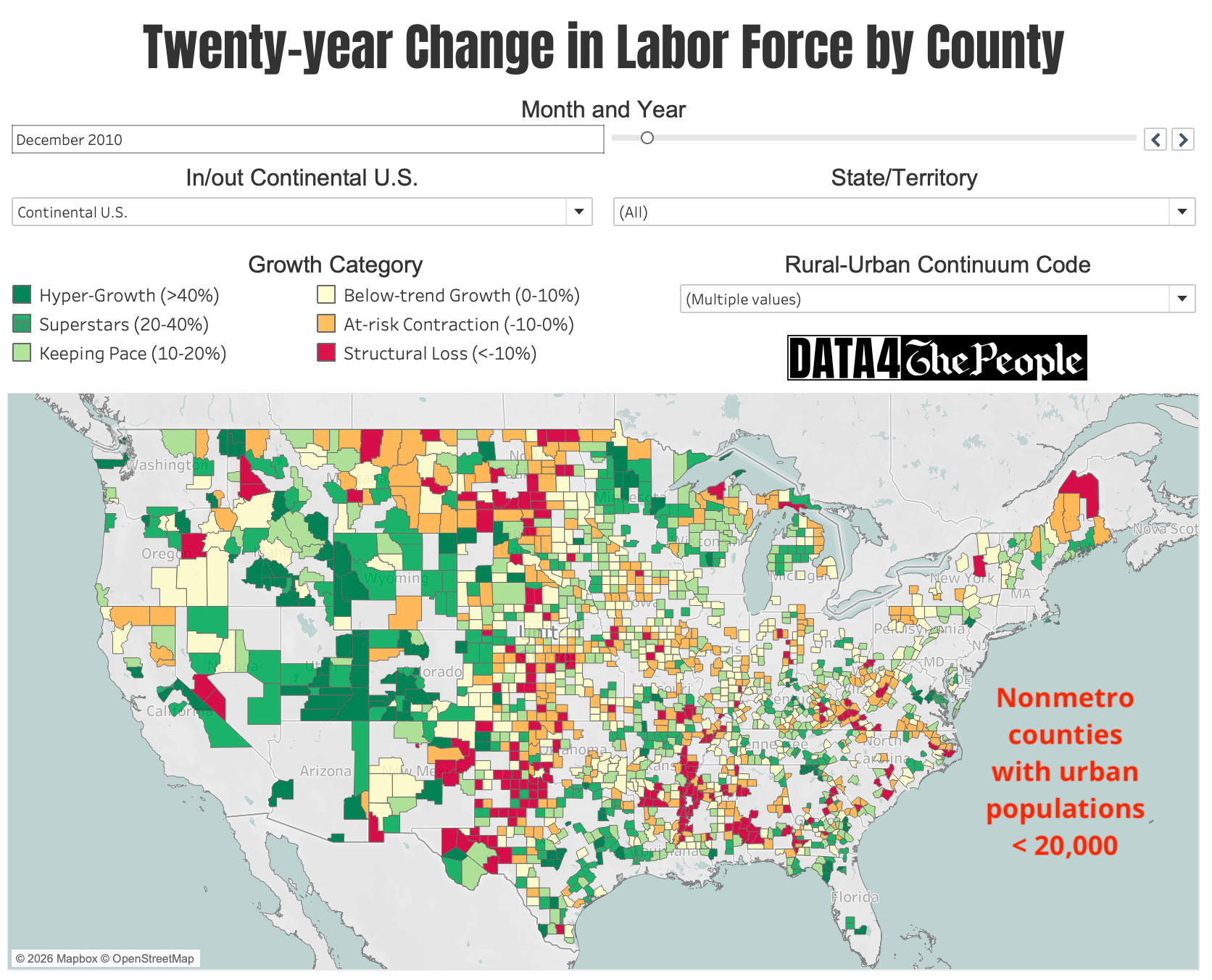
If we rewind back to look at the change in the labor force over the 20-years ending December 2010, here is what the map looks like:

Source: Data 4 The People
What jumps out?
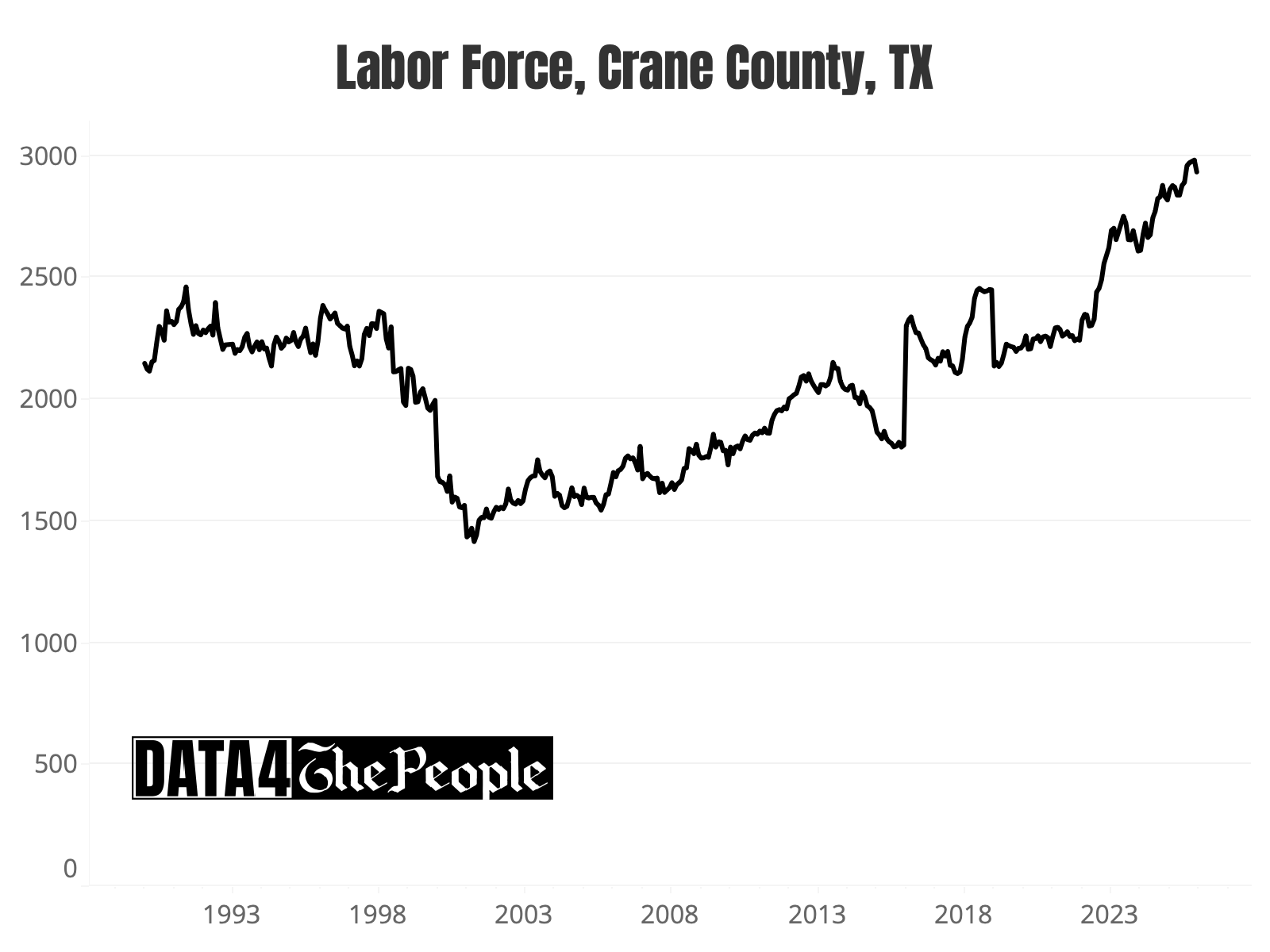
First off, red (structural loss) counties are few and far between. There is a concentration of them in the Mississippi Delta, parts of Alabama, rural Western Texas, and parts of North Dakota.
Second, the “Western Frontier” is glowing green, reflecting substantial labor force growth through Arizona, Utah, Idaho, and Colorado.
Last, notice the orange in upstate New York and parts of Michigan. This captured my attention because I know what the next map looks like. These “at-risk concentration” areas foreshadowed what was to come.
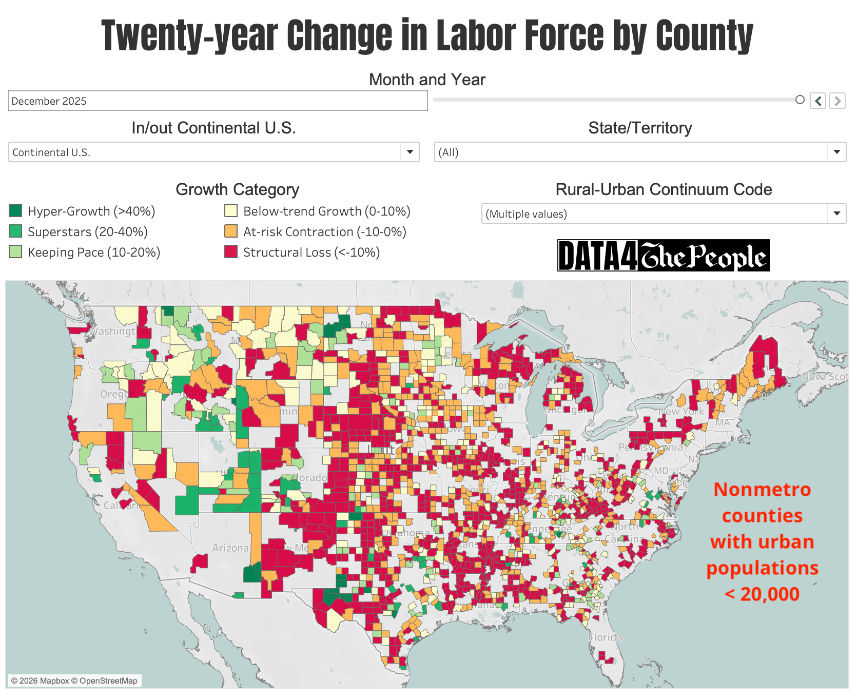
What was to come is shown in the next map, which fast forwards to the 20-year period ending December 2025.
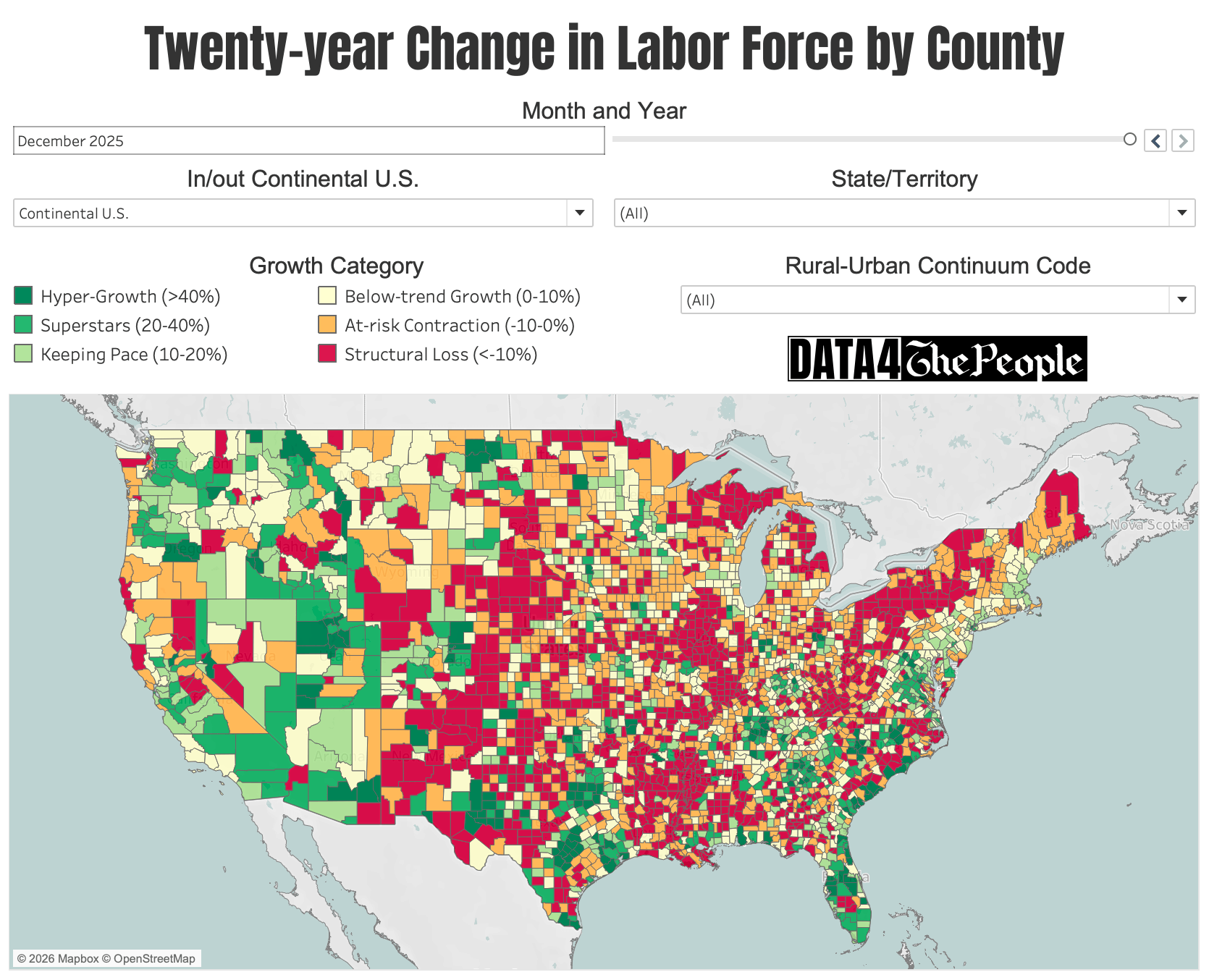
Source: Data 4 The People
What jumps out here is how “red counties” have multiplied like a virus. They are in blocks nearly everywhere now. In fact, 32% of all counties are in the “structural loss” category as of December 2025. Back in December 2010, just 8% of counties had labor forces in structural loss.
In other words, there are now four-times as many counties with labor forces down at least -10% over the prior two decades. This all happened in just the last 15 years!
While there is no one reason for this (i.e., every county has a unique story, as we will explore over time), there is one strong hypothesis that we believe we can start with to explain the rise in structural labor force decline - population aging. As shown below, aging of the local population can kick off a downward spiral, which if left unchecked, could end in municipal dissolution.

When we start to realize that aging is the main culprit, the time horizon starts to make sense as well. National data signals that there is a steep drop off in the labor force participation rate from the 55-64 year old demographic (67%) to the 65+ year old demographic (19%). Baby boomers that were 55 in 2010 are 70 in 2025. Not only is there a glut of boomers moving through the demographic “pipeline” all across America, but that’s coupled with a plunge in the labor force participation rate once they cross the 65 year threshold. As such, if these aging seniors are not being replaced in the local labor force with younger workers, we should expect counties to experience (or be on their way towards) structural decline. As Pew Charitable Trust says, “demographics are destiny.”
Takeaway #2: The extreme rural / metropolitan divergence
The cycle of structural decline hasn’t had a uniform impact on America. While each county has its own unique story, we can generally conclude the smaller more rural counties have been much more likely to decline than heavily populated metropolitan areas.
To assess this dynamic, we joined the 2023 “Rural-Urban Continuum Codes (RUCC)” (as published by the USDA ERS) with the county-level labor force trend data. The USDA assigns each county to one of the following RUCC groups:

We then looked at the growth category by 2023 RUCC. As shown below, we found an extremely strong relationship between the county size and its labor force growth category.

Source: Data 4 The People
We also added a filter to the data visualization to only view counties in a selected RUCC.
The next two maps show a comparison of the map through December 2010 and December 2025 for RUCC = 1 (i.e., metro areas >1 million population). Besides a few areas (e.g., Cleveland, Buffalo, Pittsburgh, New Orleans), the maps do not look much different, suggesting that the largest of U.S. counties have largely been able to avoid the cycle of structural decline.

Source: Data 4 The People

Source: Data 4 The People
Meanwhile, take a look at comparison of the same two periods for all nonmetro counties with urban populations less than 20,000 (RUCCs 6-9). As of December 2025, 46% of these counties had labor forces in structural decline.
Source: Data 4 The People
Source: Data 4 The People
Takeaway #3: The “saturation and siphon effect”
A fascinating takeaway from the December 2025 map is seeing key metropolitan growth hubs reach saturation and growth bleed over into surrounding counties.
There is no state where we can see this dynamic more clearly than Texas. It has happened in Austin, Dallas, and Houston (interact with the visualization to see the exact growth rates).
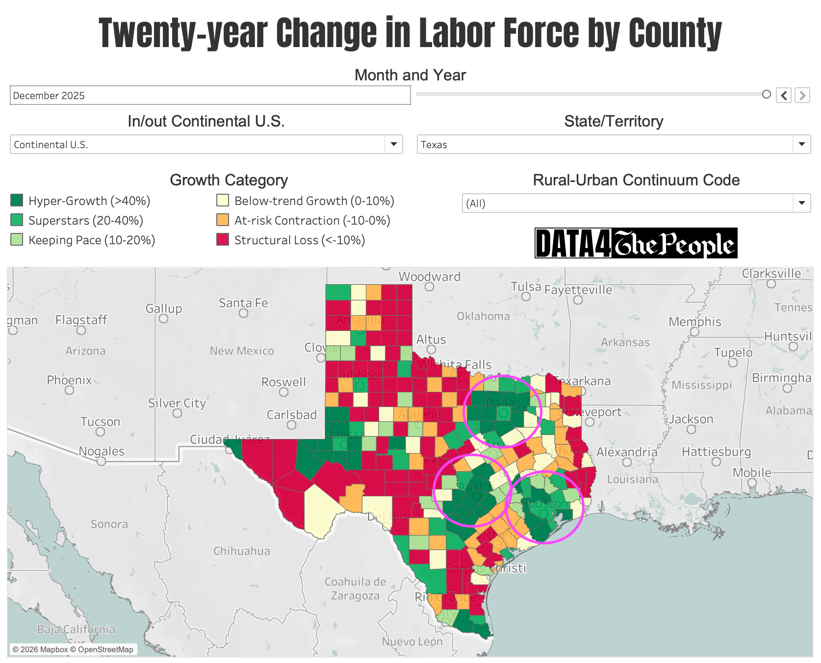
Source: Data 4 The People
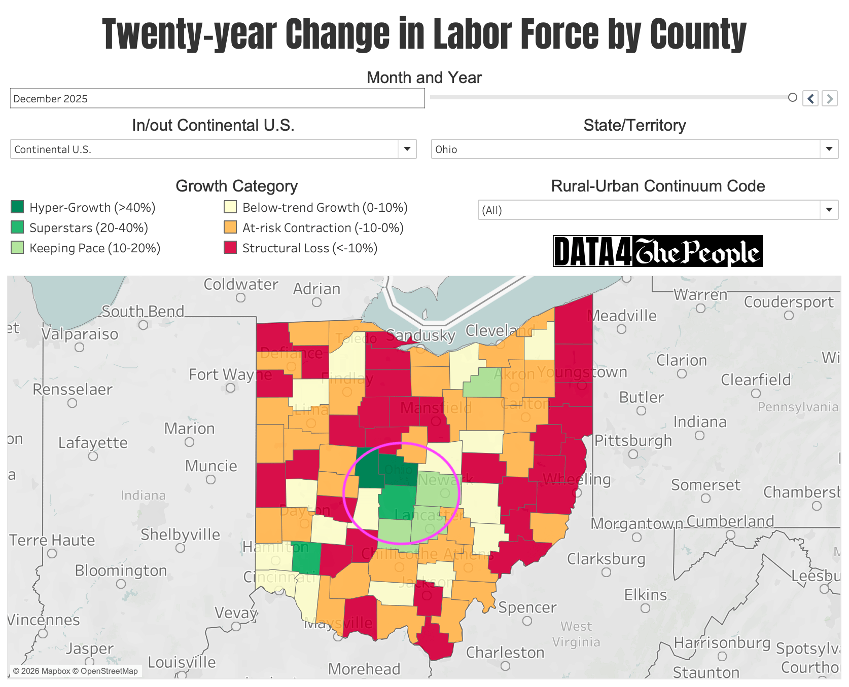
As shown in the image gallery below, we also see this dynamic in Salt Lake City, UT, Atlanta, GA, Nashville, TN, and Columbus, OH.


Takeaway #4: Fascinating hypergrowth outliers
The more time we spend with the tool, the more we come across fascinating takeaways that help us better understand pockets of America that are in hypergrowth that one may not expect!
We’ll just call out a few here, but we strongly encourage you to spend time with the tool to find all sorts of random (unexpected) counties with surging labor forces and strong economic prospects.
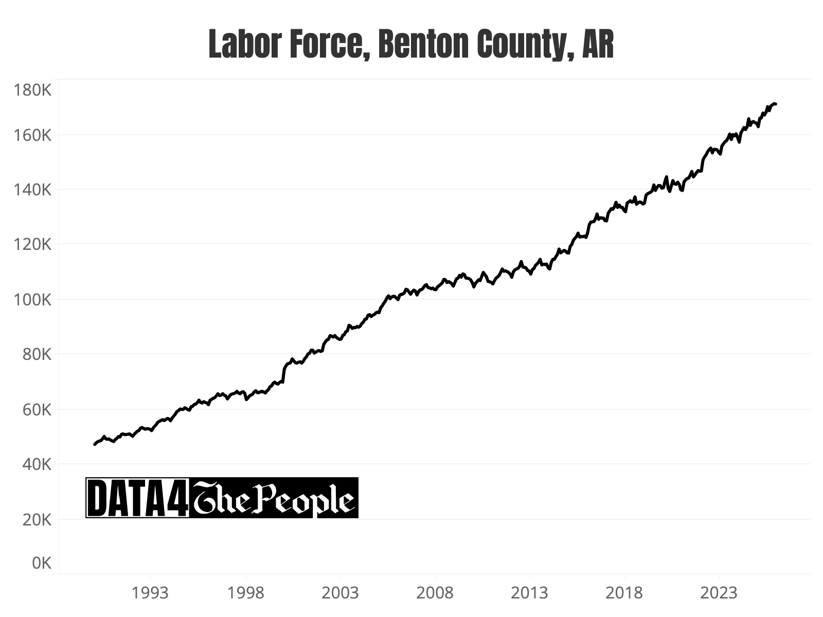
The Walmart Effect
The first county we will call out is Benton County, Arkansas, home of Bentonville and Walmart. Look at the map of Arkansas and see if you can find Benton County (hint: it’s one of just three counties in the state - out of 75 counties - in hyper-growth!).
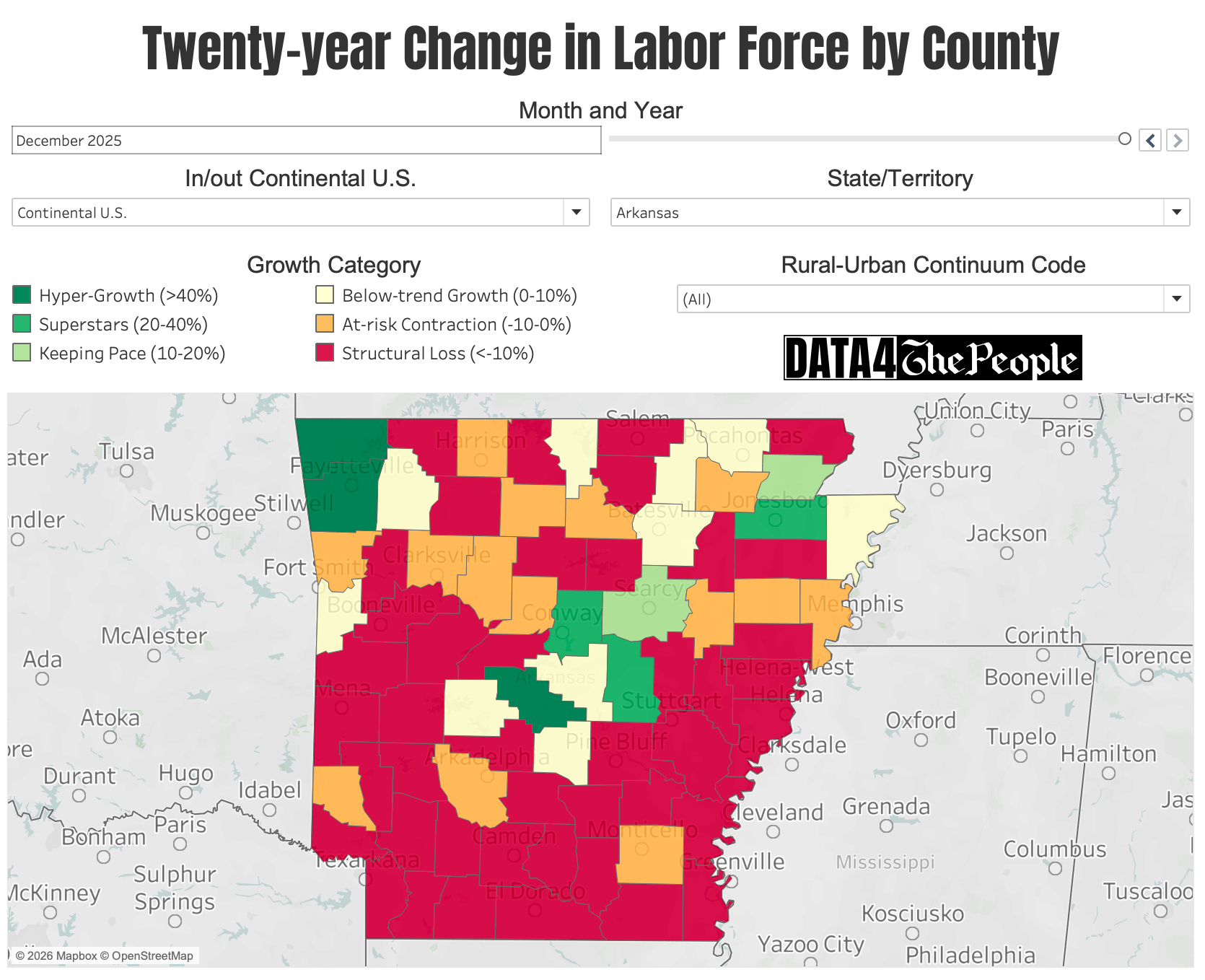
Source: Data 4 The People
If you guessed the county in the upper left, you’re right! Its labor force has grown by 70.3% over the past two decades (see chart below). The only other two counties in Arkansas with labor forces in hyper-growth as of December 2025 are Washington County (due south of Benton County and home to University of Arkansas) and Saline County (home of Little Rock).
Source: Data 4 The People analysis of data from bls.gov
Surging growth on three of Alabama’s borders
Not being from Alabama, I was surprised to see such solid labor force growth in one of the northernmost counties (Limestone), one of the easternmost counties (Lee), and the southernmost county (Baldwin) in Alabama. You’ll see they are the only three hyper-growth counties in Alabama (out of 67 counties).

Source: Data 4 The People
To understand how these three counties were able to buck the trend in Alabama, I simply asked Gemini. Here are the narratives it provided so you can try it too. I’ll have more about using AI to supplement this analysis in an upcoming post.
Limestone County: Mazda Toyota and a $7 billion Eli Lilly Campus
Limestone County has emerged as the premier growth corridor of the Tennessee Valley, transitioning from a rural satellite of Huntsville into a primary national hub for high-tech manufacturing and life sciences. This meteoric rise is anchored by the "Golden Triangle"—a massive concentration of industrial investment led by the Mazda Toyota Manufacturing plant and a record-breaking $7 billion Eli Lilly pharmaceutical campus. Since 2020, the county has led Alabama in population growth, surging by over 20% as it attracts a high-skilled labor force drawn to its 2.2% unemployment rate and rapid residential development. By leveraging its strategic position along the I-65 corridor, Limestone has effectively decoupled itself from the stagnant trends seen in other rural regions, instead creating a self-sustaining cycle of capital investment and infrastructure expansion that has made it the most dynamic economic outlier in the state.
Baldwin County: The Deepwater Horizon recovery funds that became a manufacturing magnet.
Baldwin County has solidified its position as a premier national growth engine, recently ranking as the sixth-fastest growing metropolitan area in the United States. This transformation is defined by a strategic diversification from its traditional tourism roots into a powerhouse for advanced manufacturing, anchored by the $5 billion Novelis aluminum plant—the first of its kind in North America in 40 years. This industrial surge, which has driven a 12.9% population increase since 2020, was paradoxically accelerated by the region's response to the 2010 Deepwater Horizon oil spill. While initially devastating, the influx of recovery funds provided a critical liquidity injection that allowed the community to reinvest rather than migrate, while the unprecedented media coverage of the cleanup effort served as a global advertisement for the region’s "sugar-white" beaches. This unique "comeback" effect transitioned temporary visitors into permanent residents and high-skilled workers, creating a self-sustaining cycle of capital investment and infrastructure expansion that currently outpaces nearly every other region in the state.
Lee County: Auburn University as a permanent economic anchor.
Lee County stands as a premier economic outlier in Alabama, successfully insulating itself from regional contraction by anchoring its economy to Auburn University—the state’s top-ranked public institution. With an annual economic impact exceeding $6.3 billion and a workforce of over 30,000, the university provides a permanent floor for the local tax base and a continuous pipeline of high-skilled talent. This "academic shield" is bolstered by a surging industrial sector in neighboring Opelika, which has leveraged its position along the I-85 corridor to become a primary hub for global supply chains. Recent record-breaking investments—including Miele’s new manufacturing plant and major expansions by Daewon America and Shinhwa Group—highlight the county's role as a vital link in the regional automotive and high-tech corridor. By combining the stability of a Tier-1 research university with a dynamic manufacturing base that recently secured over $570 million in new capital investment, Lee County has maintained a relentless 7.7% population growth rate since 2020, positioning it as a model for self-sustaining metropolitan expansion.
Takeaway #5: Labor force data mirrors the U.S. oil renaissance
Over the past 20-years, U.S. oil production has boomed due to technology that has dramatically lowered the breakeven cost to extract oil from large U.S. oil reserves. As shown below, two of the preeminent “tight oil plays” in the U.S. are the Permian Basin (western Texas) and Bakken (North Dakota).
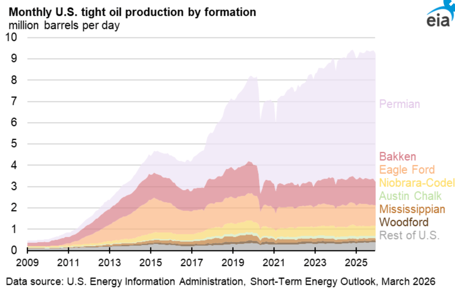
Therefore it shouldn’t come as a surprise that the counties sitting on top of these reserves are some of the fastest growing counties in America (see image gallery below).


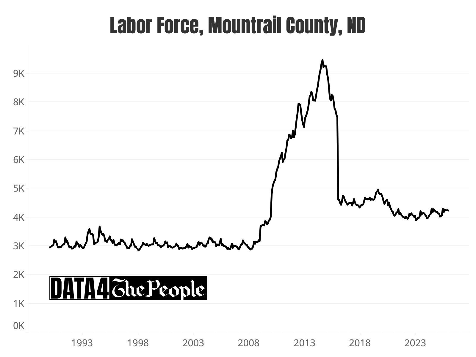

What’s fascinating is you can actually see how oil extraction economics evolved in these counties, especially in North Dakota, where drilling was widespread to start (lifting all counties) and over time shifted mostly to McKenzie County.
Sure enough, when I asked Gemini about this, here is what it said.
McKenzie County: Why North Dakota's oil boom concentrated in one place.
McKenzie County is the undisputed leader of the Williston Basin, consistently outperforming both Mountrail and Williams counties in both total volume and individual well productivity. As of early 2026, McKenzie County accounts for roughly 32% of North Dakota’s total oil production, a figure that nearly equals the combined output of Williams and Mountrail. This "Superstar" status is driven by its position over the thickest and most thermally mature sections of the Bakken and Three Forks formations. While Williams and Mountrail remain top-five producers nationally, McKenzie maintains a higher concentration of "Tier 1" acreage, resulting in average daily production levels that dwarf its neighbors. This sustained output has insulated the county from the broader "Structural Loss" seen in non-oil-producing rural areas, maintaining a high-density labor force and a robust industrial tax base that continues to fuel infrastructure expansion across the region.
If labor force data can point to something as nuanced as county-level oil breakevens, what else can it do? We’ll explore this in the coming weeks and months.
The labor force data does not lie!


